

1) "Recommended view" limiting how the user should view the interface.

Responsive Web design consists of designing and developing interfaces to respond to the user's device based on screen size, platform, and orientation.
Not on this website. It asks the user to rotate the device to a landscape orientation instead of presenting the website nicely in portrait orientation.
Not enough to limit the orientation, when the website is finally shown after rotating the smartphone, the user is presented with a bad interface, clearly not optimized for mobile.

Solution
Don't ever ask the user to adapt to your interface, your interface is the one that must adapt to the user's device.
Optimize it to EVERY possible device, orientation, and platform.
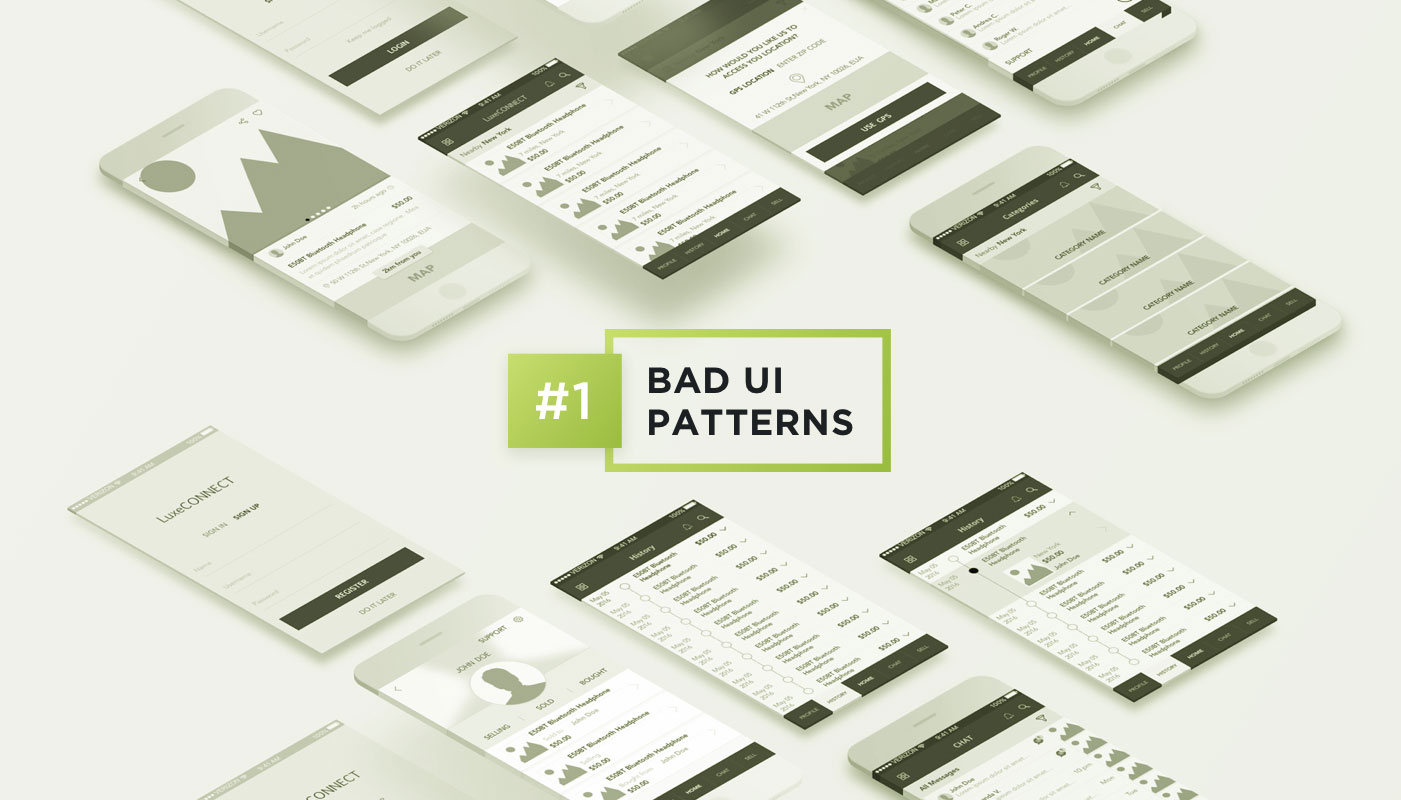
2) Primary and secondary button styles got wrong

When two or more buttons are close to each other with different priorities, we need to differentiate them. As a best practice, we can use two options:
- The primary button has the interface's primary color, which usually is a very striking or different color from the rest of the elements, and the secondary button has a less striking color, even gray in some cases.
The primary button has a background color whilst the secondary only has borders (which is debatable regarding ghost buttons, but this will be discussed in another post).
In this interface, they did the opposite for #2. The "finish" button, which should be the primary with the background only has borders. Whilst the "cancel" button which should be the secondary button has the background. The user can wrongly click on the "cancel" button without reading it properly thinking it's the "finish" button.
Solution
Follow best practices to show very clearly to the user which button is primary and which is secondary.
3) Content that's loaded after the interface is ready.

Sometimes we need to load content after the whole site is already there. But if that new content pushes everything down when being placed, you have a UX problem here.
Since the interface is already loaded, the user might be in the middle of an action, a click, a drag and drop. Having the content pushed down might cause unexpected behavior if the user clicks somewhere at the same moment that the new content appears.
The example below shows a shopping cart after adding a product. The e-commerce then loads related products on top of the cart after the content has already been loaded. If the user tries to change the quantity of the first product in the cart right at the moment that the related products are being loaded, it ends up clicking on one of them and going to the product page, frustrating the experience of buying that first product (Yeah, I did that many times, I always forget to wait for the related products, but this shouldn't be an issue the user needs to deal with).
Solution
Either load everything together or leave a space beforehand where the new content will be loaded to avoid pushing the content down.
4) Ask the user not to do something.

No, no, no. A big no-no. Never rely on the user's good behavior to avoid errors. The interface itself MUST avoid users' errors.
In this example, which is a WordPress plugin to backup and restore content, it asks the user not to click on the button until the restore is done, but leaves the button there! If the button is pressed, it can break the whole website. That's a very bad UX, it relies on the user not to break their own website! Even a wrong click can cause a mess. And if the person who is doing it is a layperson, they will have to hire a developer to fix the website.
Solution
Keep the warning not to close the browser, but remove or disable (and style them as such) the buttons that can cause error after a dangerous action begins and add an alert if the user closes the window/browser informing that some action is taking place and it's not recommended to close the browser.
P.S. Unfortunately, we can't totally block the user from closing the window/browser in cases such as this, as part of a security policy implemented by browsers, but we can at least warn users of the risks.
Update: updraft released a new version of this interface and now it's a lot more intuitive and it avoids such errors by removing the button off the screen.
5) Mislead user into paying more

Here in Brazil purchasing in installments is very common, with or without interest clearly shown to the user.
On the app below, it shows first the value of R$ 20 in 3 installments (3 x R$ 7.37 = R$ 22.11, so you're paying R$ 2.11 in interest). The user has then the option to change to 1x without interest. But if the user makes any other change like changing the credit card to pay or adding a promo code, it comes back to 3 x R$ 7.37. If this change is not noticed, the user ends up paying more than they wanted to pay.
When you click to pay, a popup will appear offering a prime service for R$ 9.99 a month, with the option already selected. Many users have complained on Google Play and Apple Store about the R$ 9.99 fee they didn't want due to their mistake of not realizing the option was already selected.
Solution
Don't try to fool your users, have the interface follow the natural and intuitive way, do not pre-select options that will increase the cost for users, and never try to earn more by hiding fees or changing something users already selected how they want.
Avoid bad sales practices, they will hurt your reputation badly and will cost way more than what you're earning with those bad practices.
Bonus: Confusing arrows

Well, UX is not only digital, it's everything that communicates with your customer.
This one I saw the other day when in a department store in town.
In the store fitting room, you're presented with three options: Women, Men, and Kids. But the arrows are all to the floor! A woman can be confused if she should go left or right there because even though the arrow is positioned at the right of the text ("provador feminino", "women fitting room" in Portuguese), it's not clear that's the right side, especially since the arrows are slightly turned to the left.
Worse, no one was using the fitting room, so the customer didn't even have a reference to follow a side since both were identical.
Solution
Don't try to create something "cool" to impress users ending up forgetting the UX. Get your arrows straight in the right direction.
Worried about bad UI patterns?
Pengreen Design has an experienced team that offers design solutions for businesses to avoid bad UI patterns. We are also featured as one of the Top Mobile App Development Companies and Top Cross Platform Mobile App Development Companies.
Let's talk about a UX Audit and discover if your product has UX flaws